Traz Felicidade
The problem
Receiving cash gifts is still confusing for wedding guests and couples:
- Gift lists look like online stores;
- It's not clear that the gift chosen is fictitious and will not be delivered to the couple;
- Many sites are slow and with ads from partner brands or stores;
- Options for birthdays are rare (probably non existent)!
The solution
Traz Felicidade is a simple platform where people can create gift lists, with aspirational or symbolic and fun items, to receive cash as wedding and birthday gifts. It has fewer features but provides a unique style and experience, delivering the core benefits compared to competitors.
https://trazfelicidade.com↗The context
In 2019, Brazil had more than 1 million weddings.
Couples getting married, people having birthday parties, and their guests are increasingly preferring to give/receive cash as gift. But they also want a meaningful, fun and easy experience.
In other words: the act of gifting needs to be more than making a PIX* or a wire transfer!
*PIX is a popular way to transfer money between bank accounts in Brazil.
The process
The challenge was discovering and prioritizing the MVP’s essential (80/20) features while creating a simple, mobile-first web app.
We started talking to couples, and researching the current available solutions.
Our main discoveries were:
- Some guests find it awkward to pick an appliance or a random item on a list to match their gift budget, even when they know the thing is just a proxy for cash;
- Some guests, especially older people, get confused when visiting the gift list because it looks like e-commerce;
- Some couples reported receiving the actual products in their homes from closer relatives who saw the items on the list and bought them in “another store,” thinking the couple was really expecting to receive the real thing.
- In general, people prefer to receive and give money because it is practical, but at the same time, they still think it is awkward to print a bank account on the wedding invitation or just make a wire transfer.
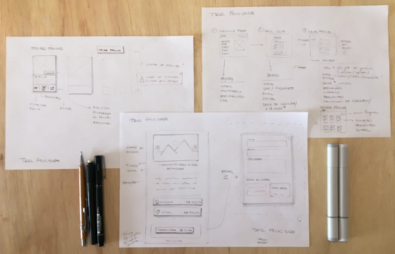
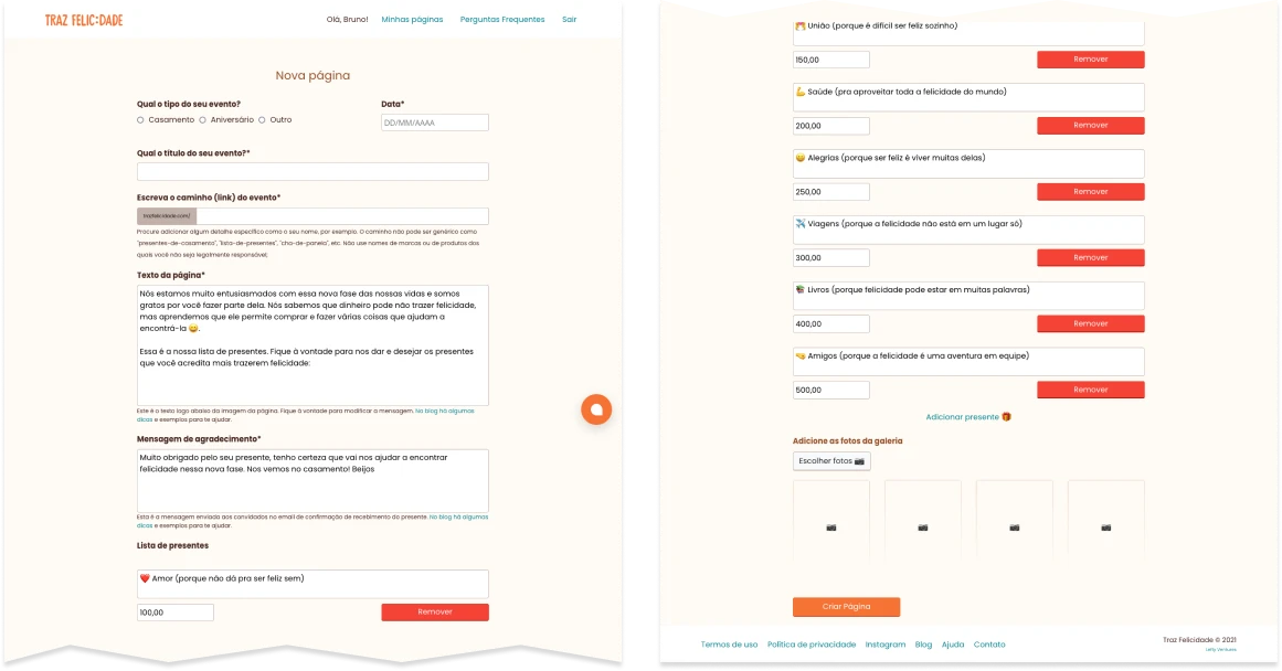
With those perceptions in mind, we started thinking about the key-benefits of our solution, sketching some process and them drawing the first interfaces.
This is a diagram showing the V0 process. It changed later, because we decide for a different business model, but I think is interesting to see and share some initial drafts:

Sketches
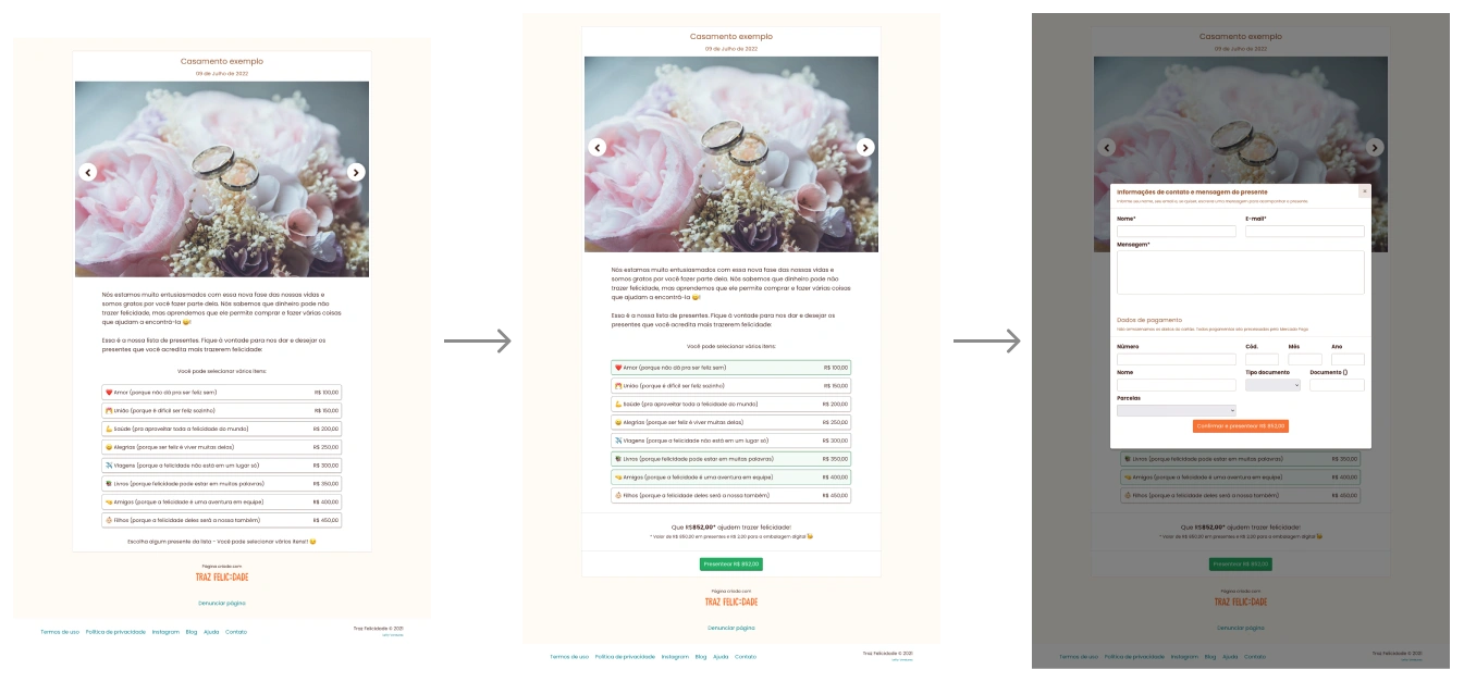
UI Highlights
The results
Although we couldn’t manage to reach a sustainable business growth yet, within our limited marketing budget and timeframe, hundreds of people successfully received their wedding and birthday gifts using Traz Felicidade and reported having a great experience. You can visit the product’s landing page to read some testimonials (in Portuguese).
Note
Because we were a two people team bootstrapping the entire platform with a tidy budget, I got the task to design and develop the product’s blog.
I used Jekyll and Bootstrap, keeping styles consistent with the web-app, and paying attention to html semantics, performance, and accessibility indicators. The blog is hosted on Netlify with continuous deploy from its repository on Github.
I also wrote many blog posts as an effort to understand the market and key-users, and as part of our launching marketing strategy.
We had the help of an amazing editor, who reviewed and proof-read the content and later repurposed some posts to create an ebook to help couples organize their wedding.
